Matte vs Glossy Photos: How to Choose the Right Print Finish
Ask ten photographers whether matte or glossy prints look better and you’ll get ten confident answers that contradict each other. After two decades of shooting landscapes and printing my own paper editions in-house, here’s mine: neither one wins. Finish is a creative decision, the same as composition or crop. The right surface depends on the image itself, the light in the room where it will hang, and the feeling you want the print to carry. A fog-soaked forest and a fiery desert sunset don’t belong on the same paper.
This guide covers what actually separates matte from glossy, where each finish earns its keep, why satin and luster exist in between, and the two papers that survived years of testing in my studio.
The Real Difference Between Matte and Glossy Photos
Every practical difference between these two finishes comes down to one thing: how the surface handles light.
A glossy print carries a smooth, reflective coating. Light hits it and bounces straight back at your eye, which is why glossy blacks look bottomless and colors seem to glow from inside the paper. That same mirror-like behavior is also why a glossy print hung across from a window can turn into a glare patch instead of a photograph.
A matte print does the opposite. Its surface has a fine, almost invisible texture that scatters light in every direction. Scattering kills glare completely. You can stand anywhere in the room and see the image, never a reflection. The trade is real, though. Scattered light softens the blacks and takes the edge off contrast, so a matte print reads quieter than the same file printed glossy.
Everything else people say about the two finishes flows from that single difference. Glossy shows fingerprints because the smooth coating holds oils where light catches them. Matte feels velvety because texture is what your fingertips register. Glossy looks sharper because specular light exaggerates edge contrast. All of it is physics playing out on a coating a few microns thick. That coating is also part of what separates a real fine art print from a poster in the first place, a difference I break down in my guide to what sets a fine art print apart from a poster.
Where Glossy Prints Earn Their Keep
Glossy is the finish of drama. Deep shadow density, saturated color, and crisp edge detail are its whole personality. When I print an image built on strong contrast, storm light breaking over a ridgeline, alpenglow against a dark valley, the glossy surface lets the blacks go genuinely black and the image snaps to life.
Glossy also resolves the finest detail of any finish. If a print rewards the viewer who steps in close, glossy keeps every thread of texture intact.
The weaknesses are just as clear. Glossy glares. In a bright room, near a window, or under poorly aimed lighting, reflections compete with the photograph and usually win. The surface also collects fingerprints during handling, which matters less once a piece is framed but matters plenty in the studio. I rarely recommend a full-gloss paper print for a sunlit living room, and I’ll tell a collector that directly.
Where Matte Prints Earn Their Keep
Matte is the finish of restraint. No glare from any angle, a soft, almost painterly surface, and a tactile quality that suits quiet images. Papers in this family range from smooth hot-press surfaces to heavily textured stocks, and the darkest-printing versions are sold as archival matte or deep matte papers, which are matte sheets engineered to squeeze as much black density as the surface allows.
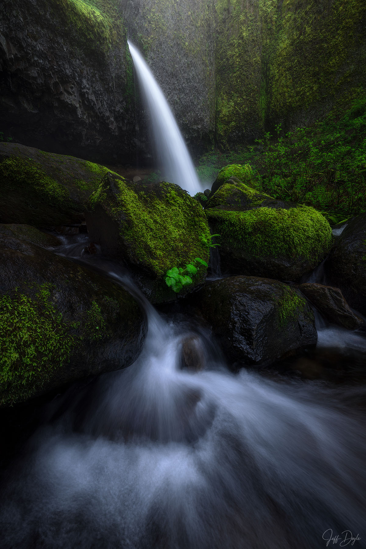
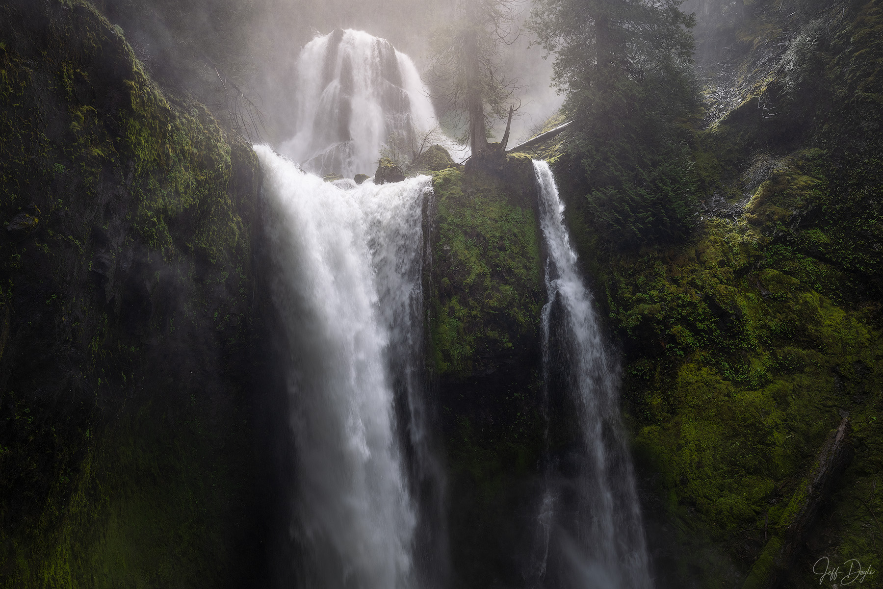
Fog is where matte proves itself. Mist, rain, low cloud, muted color: these subjects are already soft, and a scattering surface honors that softness instead of fighting it. Fog is already matte. Printing it glossy works against the image.
There’s a technical reason matte can’t match glossy for punch. A matte surface physically cannot hold the same maximum black density, and pigment printers even switch to a dedicated matte black ink for these papers. Shadows read a step lighter and the tonal range compresses. On a moody image, that compression feels intentional. On a high-contrast image, it feels like something went missing.
Satin, Luster, Pearl, and the Finishes in Between
Most of the confusion around print finishes lives in the middle of the scale, where every manufacturer invents its own vocabulary. Here’s how I translate it for collectors.
Satin and luster
Satin and luster sit between matte and glossy, and the two terms overlap almost completely. Photo labs tend to say luster, sometimes spelled lustre. Paper mills tend to say satin. If you’ve ordered from a lab and seen "E surface" on the form, that’s a luster finish too; the name is a holdover from an old Kodak paper designation. All of these surfaces carry a slight texture that tames reflections while preserving most of the depth glossy is known for. For a print that has to live in an unpredictable room, this middle ground is the safest place to be.
Pearl and metallic
Pearl and metallic papers add a pearlescent layer that gives images a shimmer, and highlights take on an almost chrome quality. It’s a striking effect for commercial work and certain city subjects. For landscape photography, I find the shimmer draws attention to the paper instead of the place, so these finishes almost never leave my studio.
Baryta, the darkroom heritage
Baryta papers are my home territory. A baryta sheet carries a layer of barium sulfate between the paper base and the ink-receiving coating, the same construction serious black-and-white printers relied on in the darkroom for the better part of a century. Modern inkjet barytas bring that fiber-print density and surface feel to pigment printing, and most of them land in the satin-to-semi-gloss range. Deep blacks, controlled sheen, and a print that feels like an object rather than a picture.

The Two Papers I Print On
I print every paper edition in-house, which means testing costs me nothing but time and ink, and I’ve spent plenty of both. Over the years I’ve run all sorts of papers through my printer. Two earned a permanent place on the shelf: Moab Juniper Baryta Rag and Canson Infinity Platine Fibre Rag.
Both made the cut for the same reason: extremely high Dmax. Dmax is the measurement of the deepest black a paper can produce, and it matters more than any other spec on the sheet. A paper with high Dmax lets me add real contrast to a print while the shadows keep their detail instead of blocking up into a void. That’s the difference between a print with presence and a print that merely looks dark.
Moab Juniper Baryta Rag is a heavyweight 305 gsm sheet, 100 percent cotton under a true barium sulfate coating, with no optical brighteners and a natural white base that leans slightly warm. The surface carries a gentle fiber gloss, and a finished print reads remarkably close to a traditional darkroom fiber print. Blacks go dense while shadow texture stays legible, which is exactly what I buy it for.
Canson Infinity Platine Fibre Rag is also 100 percent cotton, a 310 gsm sheet built on the stock Canson supplied to platinum printers long before inkjet existed. Its finish sits at satin, a step softer than the Juniper, over a cleaner white base that’s likewise free of brighteners. Canson’s own literature points to the paper’s extremely high Dmax, and my experience backs the claim. Gray tones move smoothly from paper white down to a deep, honest black.
The absence of optical brighteners matters if you’re buying work meant to outlast you. Brighteners make paper look whiter under certain light, and they fade over the decades, shifting a print’s appearance as they go. Every paper edition I sell is printed on OBA-free stock for exactly that reason, and it’s part of what stands behind the certificate of authenticity that ships with each print. If you want the full picture of how my editions work, my guide to edition sizes and print materials covers it.
Notice where both papers sit on the sheen scale: one gently glossy, one satin. That’s my honest answer to the matte versus glossy debate. After all these years, I’ve landed in the middle, where the depth of glossy and the calm of matte meet.
Matching the Finish to the Image
Here’s the framework I use when a collector asks which finish suits a piece.
Soft light wants a soft surface. Fog, mist, rain, snowfall, pastel dawn color: print these matte or on the gentlest satin. The subject and the surface speak the same language, and the image feels cohesive from paper base to frame edge.
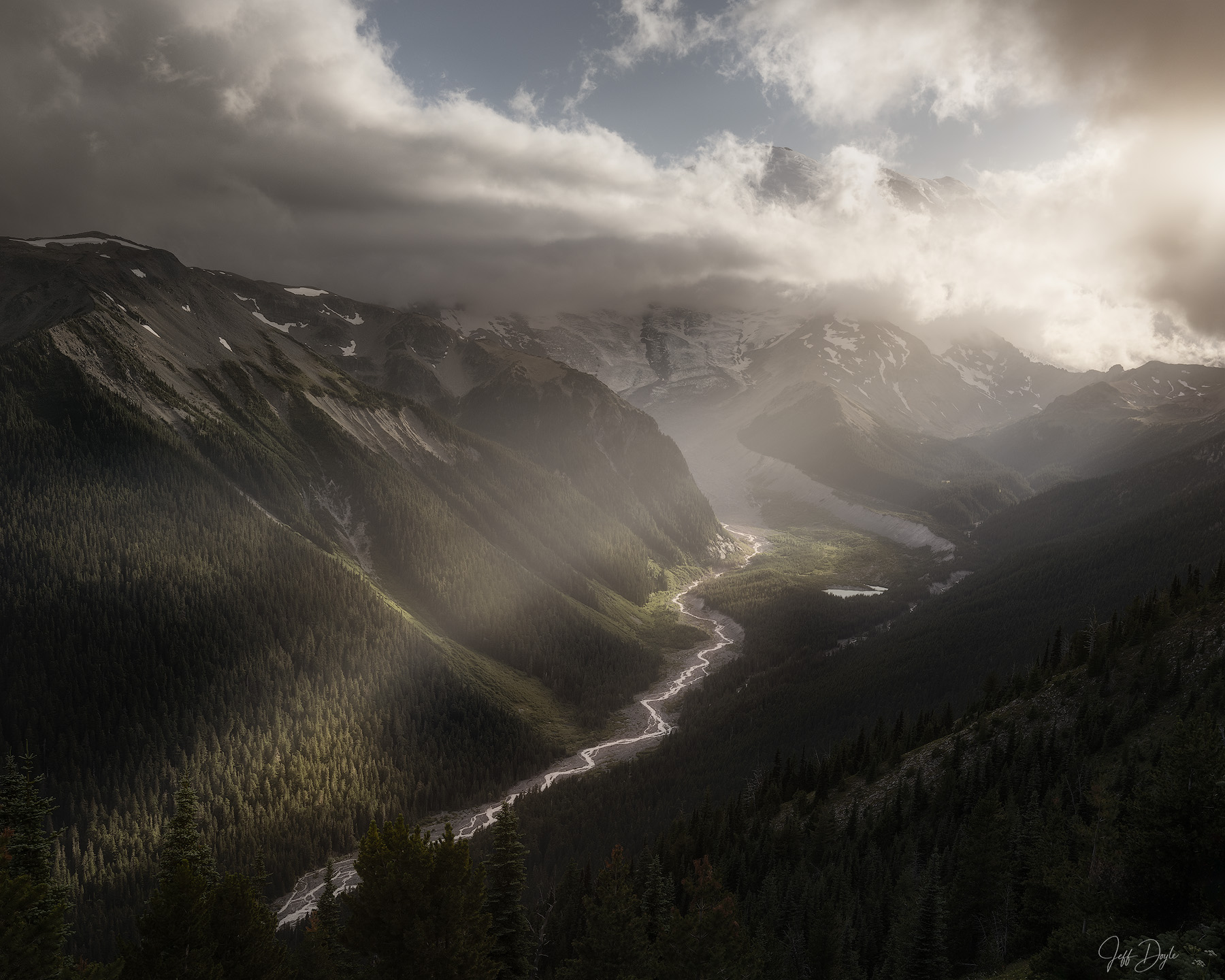
High contrast wants gloss. Storm light, deep forest shadow, saturated sunset color, hard directional light: these images have drama built in, and the glossier of my two papers, the Juniper, lets that drama register at full strength.
Everything else, and honestly most of my work, lands on satin baryta. It’s the finish I trust when an image carries both moods, which Pacific Northwest light does constantly. One frame can hold soft fog in the valley and hard light on the ridge, and the middle finish serves both.
Then think about the wall. A bright room with big windows argues for matte or satin. A hallway, an alcove, or any wall with dedicated picture lighting lets glossier surfaces come alive, because controlled light is where they perform best. I wrote a full guide on choosing the right photograph for a space, and another on matching artwork to your walls, if you’re working through that decision.
Glossy or Matte for Framing?
Framing changes the calculus, because glazing adds its own reflective layer on top of whatever finish you chose. A matte print behind standard glass still fights window reflections; they simply happen at the glass instead of the print. The real answer for a bright room is usually anti-reflective museum glass, which lets even a baryta print hang opposite a window without turning into a mirror. I cover glazing options in detail in my framing guide.
Two rules hold up well. If the print will hang unglazed or behind standard glass in a bright space, favor matte or satin. If you’re investing in museum glass, or the print will live under controlled lighting, choose the finish the image wants and let the glazing handle the reflections.
The finish question doesn’t end with paper, either. TruLife acrylic face-mounts are engineered with an anti-reflective surface, and ChromaLuxe metal prints come in both gloss and matte. My guide to edition sizes and print materials walks through how I think about each substrate.
The next time you’re holding two versions of the same image, one matte and one glossy, resist the urge to ask which one is better. Ask which one the photograph wants. The fog knows its answer. So does the storm. And if you’re deciding on a finish for a specific piece and a specific wall, reach out. Matching those two things is half of what I do.
Questions I Hear About Print Finishes
Is matte or glossy better for photo prints?
Neither finish is better across the board. Glossy delivers deeper blacks and richer color but shows glare and fingerprints. Matte eliminates glare and flatters soft, moody images but gives up contrast. Match the finish to the image and to the light in the room where it will hang.
What is the difference between matte and glossy photos?
The surface coating. Glossy prints have a smooth, reflective coating that bounces light straight back, which deepens blacks and saturates color. Matte prints have a fine texture that scatters light, which removes glare and softens contrast. Every practical difference between the two comes from how each surface handles light.
Are matte or glossy photos better for framing?
Both frame well with the right glazing. Behind standard glass in a bright room, matte and satin prints are the safer choice because glossy surfaces compound reflections. Anti-reflective museum glass removes most of the concern and lets you pick the finish the image itself calls for.
What is a luster or satin finish?
Luster and satin are middle-ground finishes between matte and glossy. Photo labs usually say luster, paper manufacturers usually say satin, and the E surface listed by many labs is the same thing. A slight surface texture tames reflections while keeping most of the depth and color richness of glossy.
What does Dmax mean on photo paper?
Dmax measures the deepest black a paper can produce. A high Dmax paper holds detail in dark shadow areas instead of letting them block up, which allows a print to carry strong contrast without losing information. It is the main reason I print on Moab Juniper Baryta Rag and Canson Infinity Platine Fibre Rag.
What paper do fine art photographers use?
Most fine art photographers print on 100 percent cotton rag papers that are free of optical brighteners, because cotton stock without brighteners holds its appearance for generations. In my studio the two papers that earned a permanent place are Moab Juniper Baryta Rag and Canson Infinity Platine Fibre Rag.