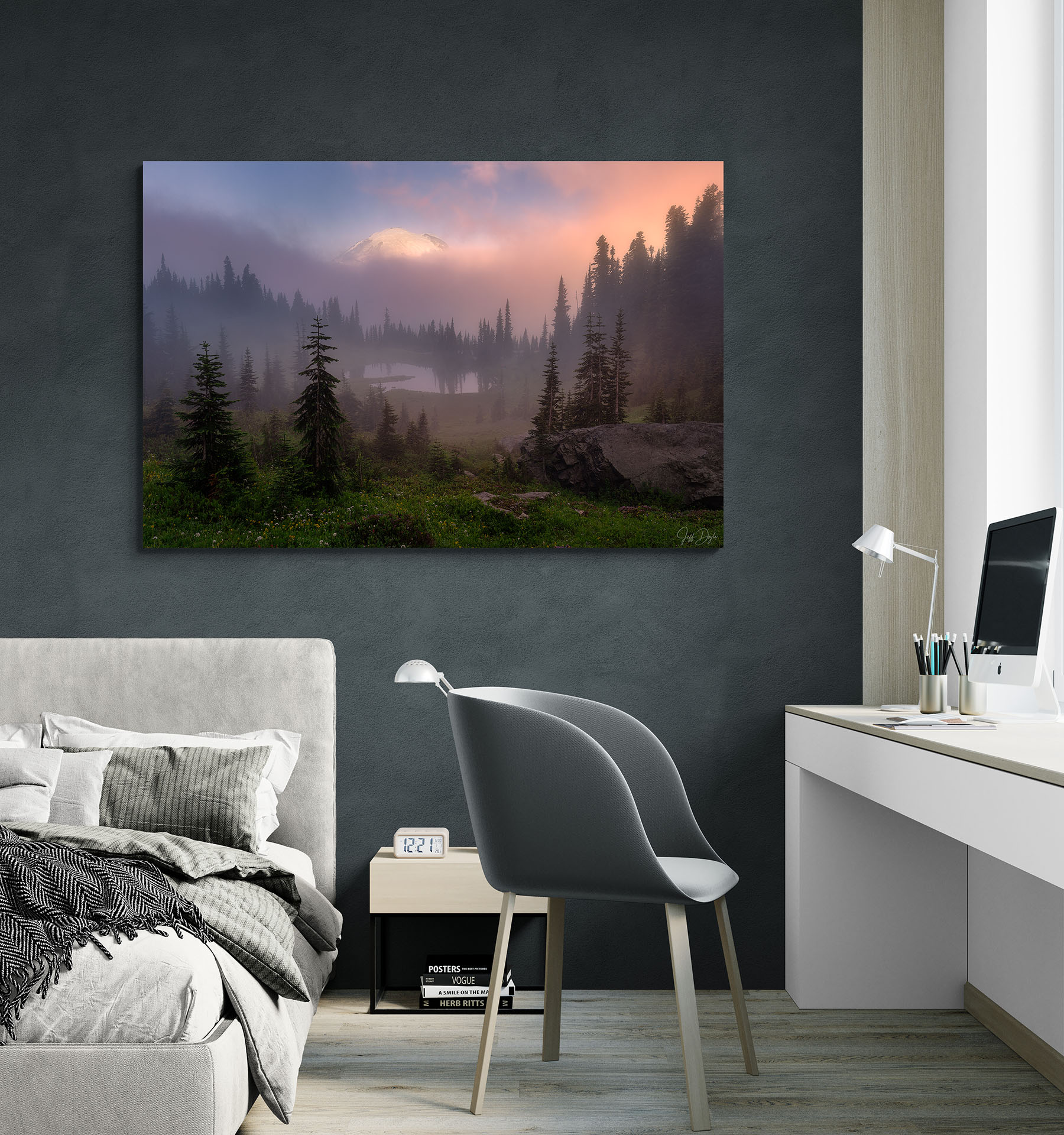
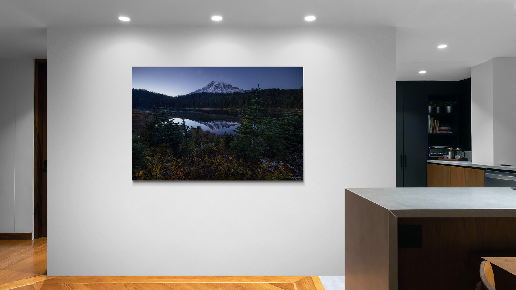
Matching art to wall color isn't about finding an exact color match. The goal is to understand how the wall's undertone, the photograph's dominant and secondary colors, and the room's light interact. The same photograph can feel expansive in one room and unexpectedly flat in another because wall color, ceiling height, nearby furniture, and changing light all influence how an image reads. When those elements work together, the artwork feels naturally connected to the room rather than simply placed in it.
A client in Bellevue had been waiting three weeks for a large coastal print of a long exposure from Ruby Beach. I’d seen it look exceptional in my studio and in test prints for months. When I helped hang it in her living room, something was off immediately. The walls were a warm terracotta she’d had for years and loved. Against that warmth, the blues in the photograph went slightly gray and flat, like the light had been wrung out of it. We moved it to a north-facing bedroom down the hall, where the light came in cool and indirect all day. The blues came back completely. Same print, same frame, same house, but an entirely different image.
This guide explains how to match fine art photography to wall color using undertones, neutral and accent walls, room lighting, and frame color—and how to evaluate the combination before you commit.
Start With the Photograph, Not the Room
Rather than trying to fit an image into an existing palette after the fact, the most reliable approach I’ve seen is to begin with the photograph and work outward. A photograph carries its own color world, dominant tones that set the register, and quieter supporting hues that often translate more naturally into surrounding décor than the obvious colors do.
Look at an image you’re considering and ask which tones sit in the background rather than the foreground. Those quieter colors such as the muted blue of a shadow or the soft gray-green of distant trees usually work best when echoed on walls and larger surfaces. The stronger accent colors in the image are better echoed in smaller doses such as a textile, a frame detail, or a single decorative object. When a room is designed this way, building outward from the image rather than forcing the image into a predetermined scheme, the result feels like it happened naturally rather than by calculation. If you've already picked out a piece, you can think about what size art will work best for your wall.
How Wall Color Undertones Affect Landscape Art
Paint colors are almost never as simple as they appear on a swatch. What reads as a clean white in isolation often carries a whisper of yellow, blue, or green that only becomes visible once there’s art on the wall. What looks like a neutral gray can shift noticeably warm or cool depending on the light in the room at different times of day.
This matters because undertones in the wall interact with undertones in the photograph. A cool gray can sharpen a misty mountain image, making it feel crisper than it did in another context. That same image against a warm cream wall may read softer, even slightly muted.
As a measurable starting point, most of my Pacific Northwest and alpine work, which is blue- and gray-dominant, sits best against neutrals in the LRV 60 to 80 range (Light Reflectance Value, printed on most paint chips). That band gives the image authority without the wall going stark and cold against cool tones. Warmer desert and golden-hour images tolerate lower, warmer LRV comfortably.
The most useful thing you can do before committing to paint is hold a print sample or a corner of the actual frame against the wall and look at it in the room’s natural light at the time of day the room is most used. A paint swatch alone tells you very little. The interaction between the wall, the image, and the specific light in that room is what you’re actually evaluating.
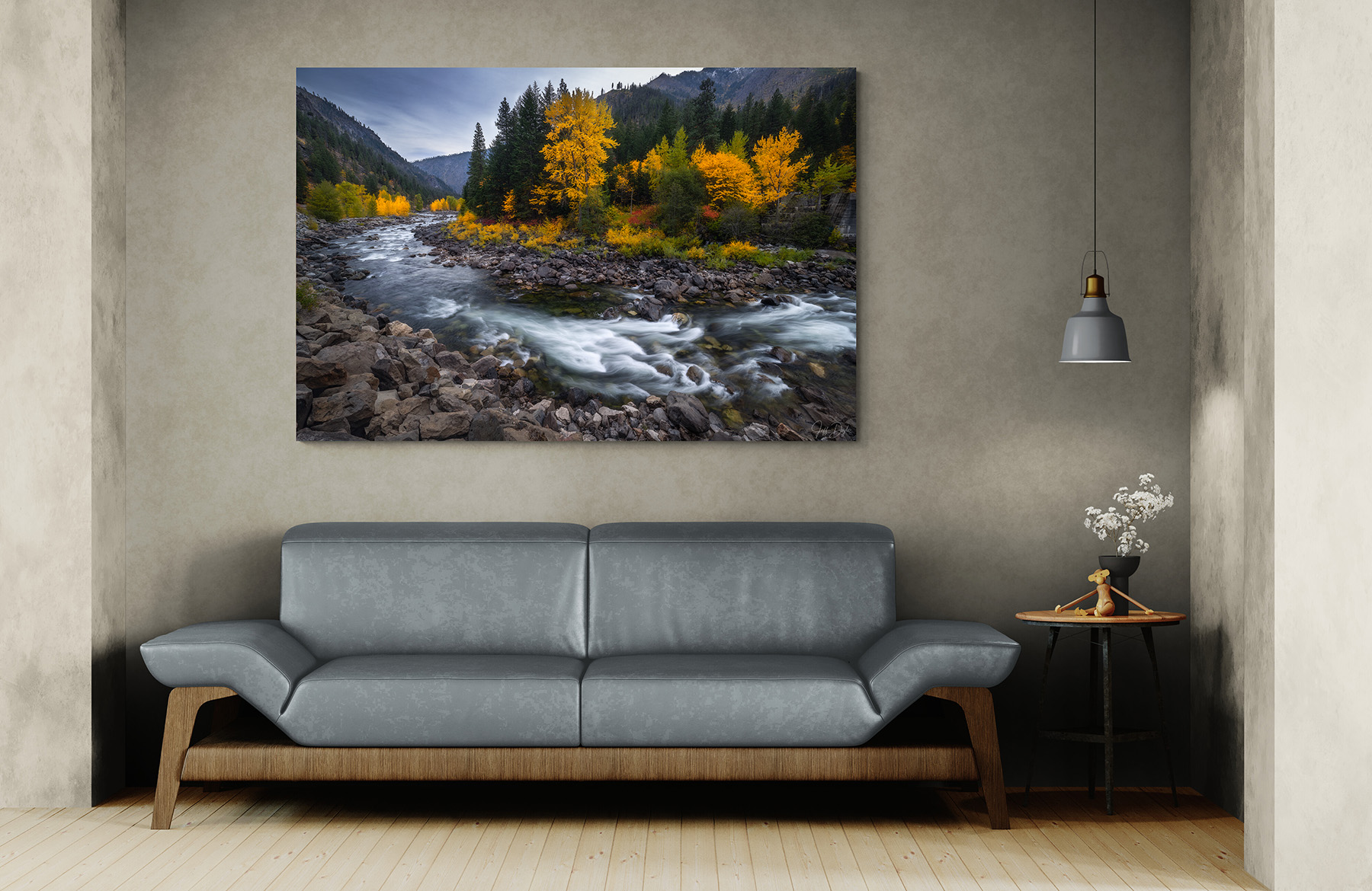
What Wall Color Is Best for Displaying Art?
Soft whites, warm grays, and muted earth tones are the most reliable wall colors for displaying art because they allow the artwork to lead without competing with it. The best choice depends less on whether a wall is technically white, gray, or beige than on whether its undertone works with the photograph's overall warmth or coolness.
This doesn’t mean neutral walls are passive. For example, a cool white and a warm white read very differently behind the same image. A warm off-white behind a photograph with golden light will amplify that warmth; a cool white will hold it at arm’s length. These subtle differences are useful when evaluating images against different walls.
In my experience, neutral walls are the right starting point when you’re not certain about the relationship between a specific image and a specific room. They give you flexibility to adjust other elements such as framing, textiles, or lighting without the wall itself foreclosing options. Once you’ve lived with an image in a neutral space for a while, you’ll have a much clearer sense of what the room actually needs.
What Art Looks Best on a Dark Accent Wall: Navy, Green, Charcoal, and Terracotta
Saturated wall colors such as deep blues, forest greens, terracotta, or charcoal can be beautiful, but they narrow the range of photographs that will work against them. The most common mistake is accidental competition: a photograph with strong color placed against a wall with equally strong color, neither one willing to recede. The result is visual noise rather than presence.
There are two approaches to this problem that work. The first is contrast: a quieter, more tonal image against a saturated wall, where the wall provides drama and the photograph provides relief. A misty forest image or a soft coastal scene can feel unexpectedly powerful against a deep navy wall precisely because it doesn’t fight back. The second approach is echo: a photograph that shares the wall’s color family, but in a different register that is lighter and more atmospheric with the wall’s dominant color, appearing as a secondary tone rather than the primary one. The pairings below are a reliable map:
| Wall Color | Image Type That Works | Why | What to Avoid |
|---|---|---|---|
| Deep navy | Misty coastal, snow, high-key alpine | A quiet tonal image provides relief against the drama of the wall | Saturated blues: image disappears into the wall |
| Forest green | Pale granite, snow, high-key alpine | A low-color image lets the wall supply depth and the print supply light | Vivid greens: competition, neither wins |
| Terracotta or warm clay | Desert southwest, golden-hour, autumn foliage | A shared warm family in a lighter register reads as a secondary tone | Cool blues: temperature clash flattens both |
| Charcoal | High-contrast black and white, dramatic skies | A tonal image holds its own without color competition | Low-contrast muted tones: image loses definition |
A client in Seattle had painted his home office a deep forest green. It was so dark that it read almost like shadow at certain times of day. We tried several options before settling on an image from Mount Rainier: pale granite, open sky, early morning snow, almost no color in it. Against that wall it was striking. The wall provided depth; the photograph provided light. The images that hadn’t worked were ones with strong color of their own. They fought the green for dominance, and neither won.
Matching the wall too closely to the dominant color in a photograph can cause the image to lose separation from its surroundings. Often, a better approach is to echo a secondary color or use the same color family at a noticeably different value or intensity. If you are weighing a piece against a strong wall color, send me a photo of the room and I'll tell you whether it's going to work, and what to change if it isn't.
How to Match Your Frame to Your Wall Color
Frames are the transition between the photograph and the wall, and when that transition is jarring, the eye notices it even if the viewer doesn’t consciously register why. A bright white frame against a warm cream wall creates a subtle tension that lingers, while a natural wood one in a cool, modern space can feel displaced. That's the kind of thing that leaves a room feeling slightly unresolved, without anyone being able to name the cause.
My consistent recommendation is to match the frame’s undertone to the wall’s undertone rather than matching the obvious color. A warm-toned wall calls for a frame with warmth in it. For example, a natural wood, a warm matte black, and antique brass. A cool wall works better with a cooler frame: brushed silver, a clean bright white, matte black with a blue-gray base. The frame doesn't need to match the wall's visible color; it simply needs to belong to the same tonal world.
Mat width matters as much as frame style and gets overlooked more often. A generous mat, three to five inches depending on print size, gives the image room to breathe and signals care was taken in the process. A thin mat or no mat makes even a quality print feel compressed. If you’re going to invest in a good photograph, invest in a mat that gives it the space it deserves. For the full breakdown of mat widths by print size, conservation glazing, and mounting by substrate, I've written a comprehensive guide on professional framing and mounting.
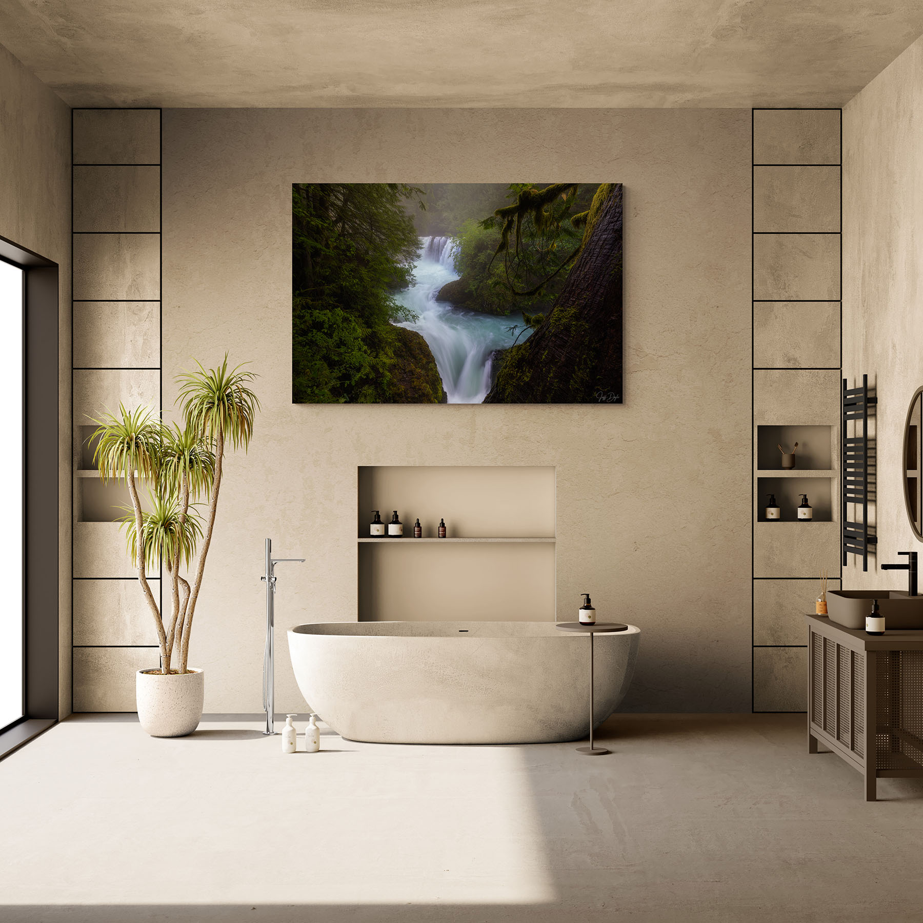
How Room Lighting Changes the Way Fine Art Photography Reads on a Wall
A print doesn’t live in static conditions. Morning light, afternoon sun, evening artificial light: the photograph you hung last week reads differently throughout the day, and differently again across seasons. There's nothing to solve there. A print that changes through the day is one of the pleasures of living with photography. But it does mean that evaluating a print’s relationship to a room once, under one set of conditions, isn’t enough.
Warm bulbs bring out reds, ambers, and golden tones in a photograph while cooling blue tones slightly. Cooler daylight bulbs sharpen the blues and greens in a print. A room with significant natural light will show the print differently at noon than at dusk. Direct sunlight can create glare and prolonged light and UV exposure can contribute to fading or deterioration over time. Indirect natural or artificial light is generally preferable for displaying fine art photography.
The practical implication of all this is to evaluate the wall at the time of day the room is actually used. A bedroom you live in at night reads completely differently than it does at noon. A home office that gets afternoon sun presents different conditions than a north-facing living room. The right photograph for that space is partly determined by that light, which means seeing the wall under real conditions before committing is worth the extra step.
How to Choose Fine Art Photography for a Room That's Already Designed
Sometimes the room is essentially finished and the photograph needs to fit into it. This is a harder design problem, but it’s solvable. The key is identifying the room’s existing tonal temperature, not its obvious color, but whether it reads warm or cool overall, and finding a photograph that operates in the same register without simply repeating it.
In a room with warm wood tones, leather, and amber light, a photograph with cool blues and sharp contrast will feel imported from a different visual world. That room would generally be better served by an image with warmth in it: golden late-afternoon light, earth tones, or the soft greens of a sunlit forest. In a modern, cooler-toned space with stone, glass, and neutral grays, the same warm landscape might feel out of place, while a high-contrast black-and-white or a cool coastal image would feel at home.
Sizing, Material, and Placement: Related Collector Guides
Wall color is one decision when thinking about fine art. Three others shape how a landscape photograph reads, and I've written a guide on each:
- Size: The right dimensions for a fine art photograph depend on the room and the wall.
- Viewing distance and hanging height. How far back a piece is seen, and the 57-to-60-inch center rule, are covered in How to Hang Fine Art Photography.
- Substrate. Whether an image suits acrylic, metal, or paper depends partly on the wall and its light.
If you’re working through placement decisions and want a second set of eyes before committing, I’m reachable directly. Send me the wall dimensions, a photo of the room, and the image you’re considering, and I can usually tell you quickly whether it’s going to work, and why.
Frequently Asked Questions About Matching Art to Wall Color
What wall color is best for displaying art?
Soft whites, warm grays, and muted earth tones are reliable starting points because they allow the artwork to lead rather than competing with it. Undertone matters more than the paint-color name: look for a wall whose underlying warmth or coolness works naturally with the photograph.
What art looks good on a dark accent wall?
A quieter, lower-color image (pale granite, snow, high-key alpine) or a high-contrast black and white reads best against a dark wall, with the wall supplying depth and the print supplying light.
What color art looks best on blue walls?
Blue walls work well with photographs that either provide tonal contrast or echo the blue more subtly. Misty landscapes, snow scenes, pale mountain images, warm golden-hour photographs, and black-and-white work can all create separation from a blue wall. Avoid matching a strongly saturated blue wall with an equally saturated blue photograph unless there is enough difference in value and tone to keep the image distinct.
How do I match art to a room with mixed warm and cool elements?
Identify which temperature dominates the room overall and choose an image in that register, then let the secondary temperature show up in a smaller accent. An image with a neutral bridge tone, warm light over cool water, for example, sits comfortably in a mixed room without taking a side.
Should the frame match the wall or the photograph?
Match the frame's undertone to the wall's undertone rather than the obvious color. A warm wall calls for a frame with warmth in it, such as natural wood or warm matte black; a cool wall pairs better with brushed silver, bright white, or a blue-gray black.
How do I choose art for a room that's already finished?
Identify the room's overall tonal temperature, whether it reads warm or cool, then choose a photograph that operates in the same register without repeating the dominant color exactly.
Does fine art photography need to match the room's color scheme?
Not exactly. The most successful installations share a tonal temperature with the room. Repeating a secondary tone from the photograph in a textile or accent object creates coherence without the stiffness of an obvious match.