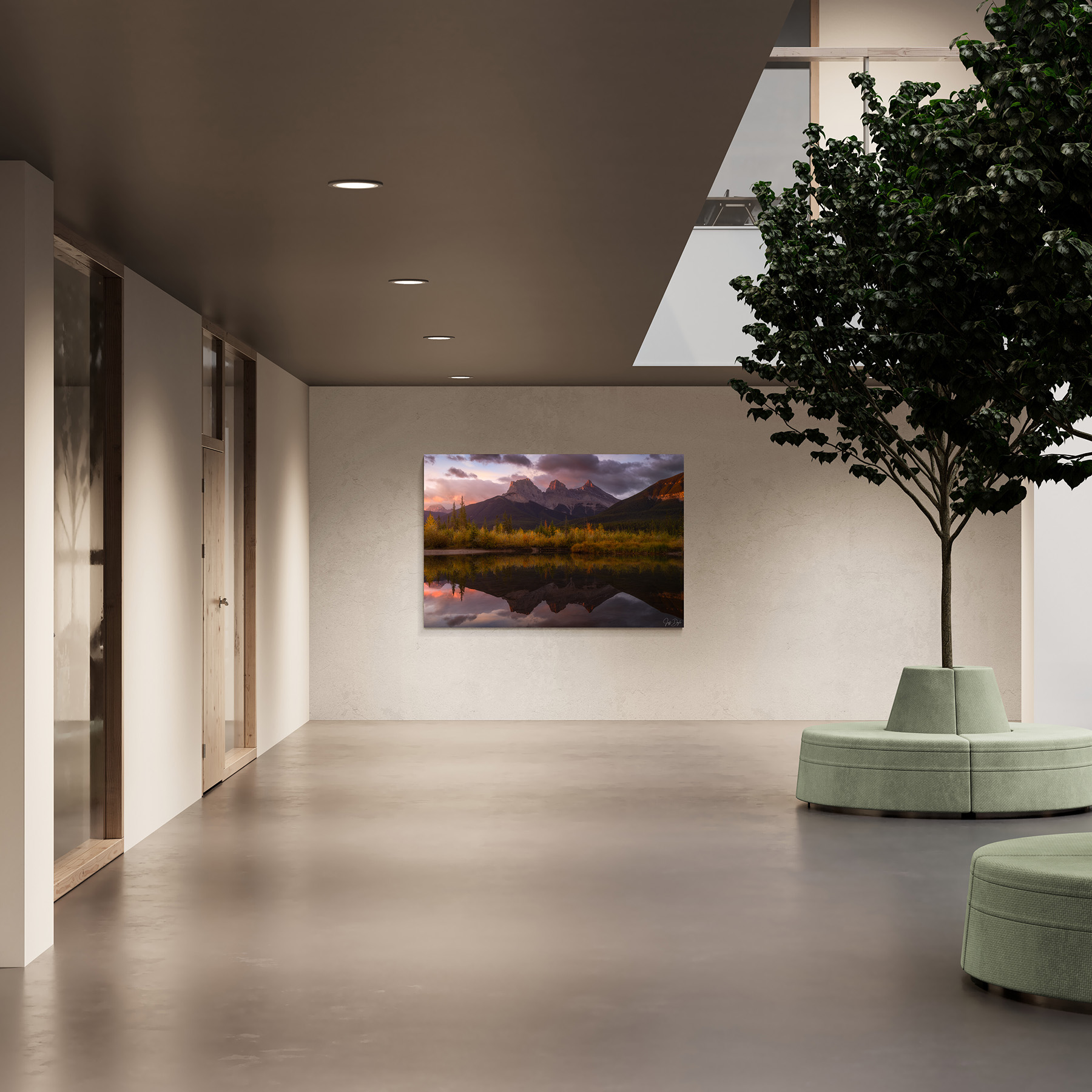
How to Choose Art for an Office or Commercial Space
Choosing art for an office or commercial space requires more than finding an image that looks good on a screen. Scale, materials, subject matter, lighting, viewing distance, and the function of the room all affect how artwork performs once it's installed. Over the past ten years, I've worked with designers, businesses, and collectors to select and install fine art photography in offices, hospitality settings, and client-facing commercial spaces across the Pacific Northwest, the American West, and the Mountain West. Much of this guide comes directly from seeing what holds up in real commercial installations—and what doesn't.
Start With Purpose: What Should the Space Do?
Effective art selection begins before choosing individual pieces. Each space has a different function, and the biggest disconnect I see consistently is when a single aesthetic gets applied everywhere. A piece that feels energizing in a lobby can feel overwhelming in a conference room where people are trying to concentrate for hours.
Before selecting anything, it’s worth thinking through a few basic questions: What is this space meant to do: welcome, focus, restore, celebrate? Who primarily uses it: clients, employees, patients, partners? And what should the environment communicate about the organization? The answers to those questions should drive the selection.
Landscape photography works well in professional environments because it communicates stability and openness without relying on literal messaging or trend-dependent imagery. Natural imagery also provides visual relief in spaces dominated by screens, hard surfaces, and artificial light, which is true of most commercial interiors.
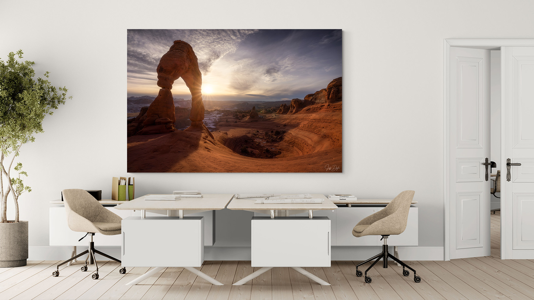
Plan Office Art Around the Space Before Choosing Individual Pieces
One of the most common commercial mistakes is buying art before understanding the wall. Before selecting anything, identify where each piece will live and how it will be seen.
Create a simple wall plan that covers reception and primary sightline walls, conference rooms, hallways and transition spaces, executive offices, and any lounge or waiting areas. For each location, note the wall dimensions, furniture placement below the art, and typical viewing distance. A print viewed from across a large reception area needs far more visual presence than one seen at close range in a corridor. These are different problems that require different solutions.
Case insight: In one office installation, a client had selected several medium-sized prints for a large reception wall. Once installed, the wall still felt empty. Replacing them with a single large-format piece immediately grounded the space and gave it a sense of intention without changing the subject matter at all. Scale was the entire issue.
Align Artwork With Brand Identity (Without Feeling Branded)
In commercial settings, art supports brand identity best when it whispers rather than shouts. Matching artwork directly to corporate colors or logo palettes usually produces results that feel promotional rather than considered. The more effective approach is to think in terms of tone and emotional signal.
For example, a technology firm may benefit from dramatic light and strong compositions that convey precision and forward motion. A healthcare or professional services environment typically works better with softer tonal transitions and calming imagery. Businesses with strong regional roots can reinforce a sense of place through local landscapes without the space feeling like a marketing exercise. When art aligns with values rather than slogans, it tends to strengthen credibility quietly and durably.
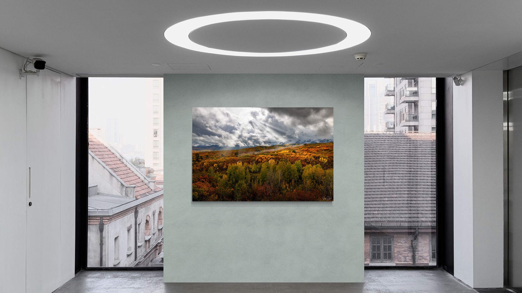
Regional Landscapes and a Sense of Place
For many organizations, location is part of identity. Whether a company is rooted in the Pacific Northwest, the Desert Southwest, or a specific city, artwork can quietly reflect that connection without announcing it.
In offices in Seattle, Portland, and the Mountain West, the right landscape image can make the space feel like it belongs to the people who work there rather than a generic commercial interior. This could mean choosing a Cascade ridgeline, a high desert horizon, or a Pacific coastline at dusk so that the space stops feeling like décor ordered from a catalog and starts feeling considered. In regions where outdoor culture is woven into daily life, landscape photography tends to resonate naturally without needing explanation.
Best Office Art by Space: Lobbies, Conference Rooms, Hallways, and Offices
This reference pairs each commercial space with a size range, the substrate that holds up best, and the lighting it lives under, so a designer can resolve scale, medium, and lighting in one pass. Because each image is a limited edition of 100 that ships with a Certificate of Authenticity, a program is built on documented, artist-direct editions rather than open-stock decor.
| Commercial Space | Recommended Print Size | Best Substrate | Typical Lighting | Treatment |
|---|---|---|---|---|
| Reception / lobby (anchor) | 48x72 and larger | ChromaLuxe Metal or Lumachrome Acrylic | Mixed daylight + LED | One statement piece, not many small works |
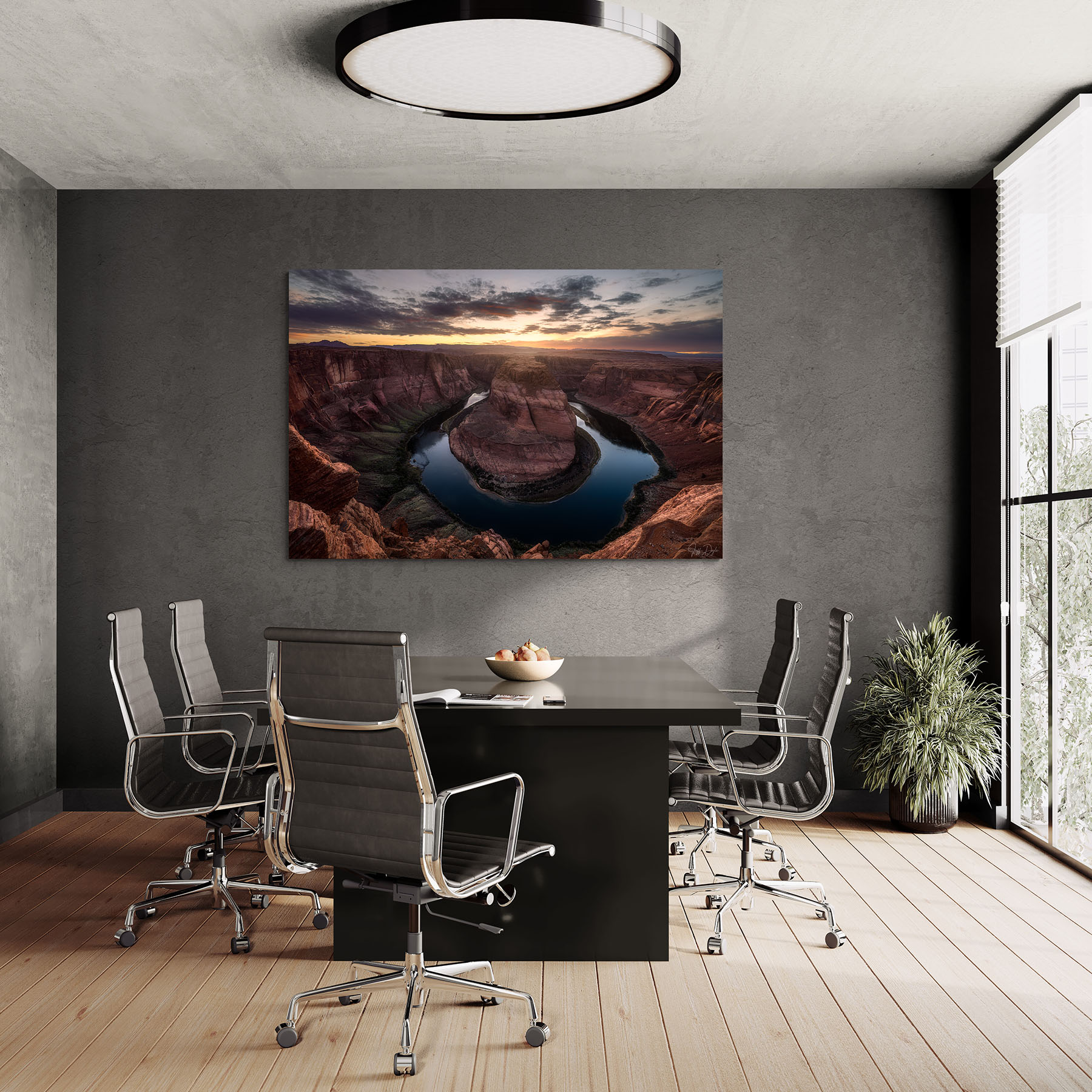
| Conference room | 30x40 to 40x60 | Metal or acrylic | Controlled LED | Balanced, restrained composition |
| Corridor (series) | 20x30 or larger, depending on corridor width | Metal | Fluorescent / LED | Consistent spacing and presentation |
| Executive / private office | 24x36 to 30x40 | Framed cotton rag or metal | Low, controlled | Depth and nuance that rewards longer looks |
| Hospitality / waiting | 24x36 to 30x45 | Metal or acrylic | Mixed | Calm imagery, soft contrast |
Office Wall Art for Reception Areas and Lobbies
First impressions matter, and scale matters most here. Large-format photography anchors the architecture and signals intention immediately. I’ve consistently found that reception areas benefit from fewer, larger pieces rather than many smaller ones. One well-chosen piece almost always outperforms a wall covered with medium-sized work.
Conference Rooms and Collaboration Spaces
These spaces need artwork that supports focus without distraction. Balanced compositions, restrained palettes, and natural textures tend to hold up well over long meetings. Avoid imagery that is too busy or emotionally loaded because it competes rather than supports.
Hallways and Transitional Spaces
Series, diptychs, and triptychs create rhythm and movement in corridors. Repetition with variation keeps long spaces visually engaging without overwhelming them. Consistent framing and presentation tie the sequence together.
Executive and Private Offices
In more intimate spaces, artwork becomes part of personal and professional identity. Medium-sized prints with depth and nuance tend to work best because they reveal more the longer you look at them.
Hospitality, Wellness, and Waiting Areas
Comfort is the primary goal here. Calm imagery, softer contrast, and gentle light help reduce stress and create a welcoming atmosphere. These are spaces where people are often anxious or tired, and the artwork should work against that rather than add to it.
Planning a multi-space program? Tell me about your spaces and I will map sizes, substrates, and a phased plan with you.
Scale and Proportion: Where Most Offices Go Wrong
The most common issue I see in commercial spaces is artwork that is too small. A piece that feels generous in a home gets lost on a commercial wall.
Artwork above furniture should generally span two-thirds to three-quarters of the furniture width. Large walls almost always benefit from a single statement piece rather than multiple smaller works arranged together. Long corridors work well with evenly spaced series at consistent heights.
In nearly every commercial installation I’ve worked on, the decision to increase scale, or to simplify the layout, made the space feel more refined. It rarely worked the other way around.
For detailed hanging-height and placement guidance, see my guide to How to Hang Fine Art Photography.
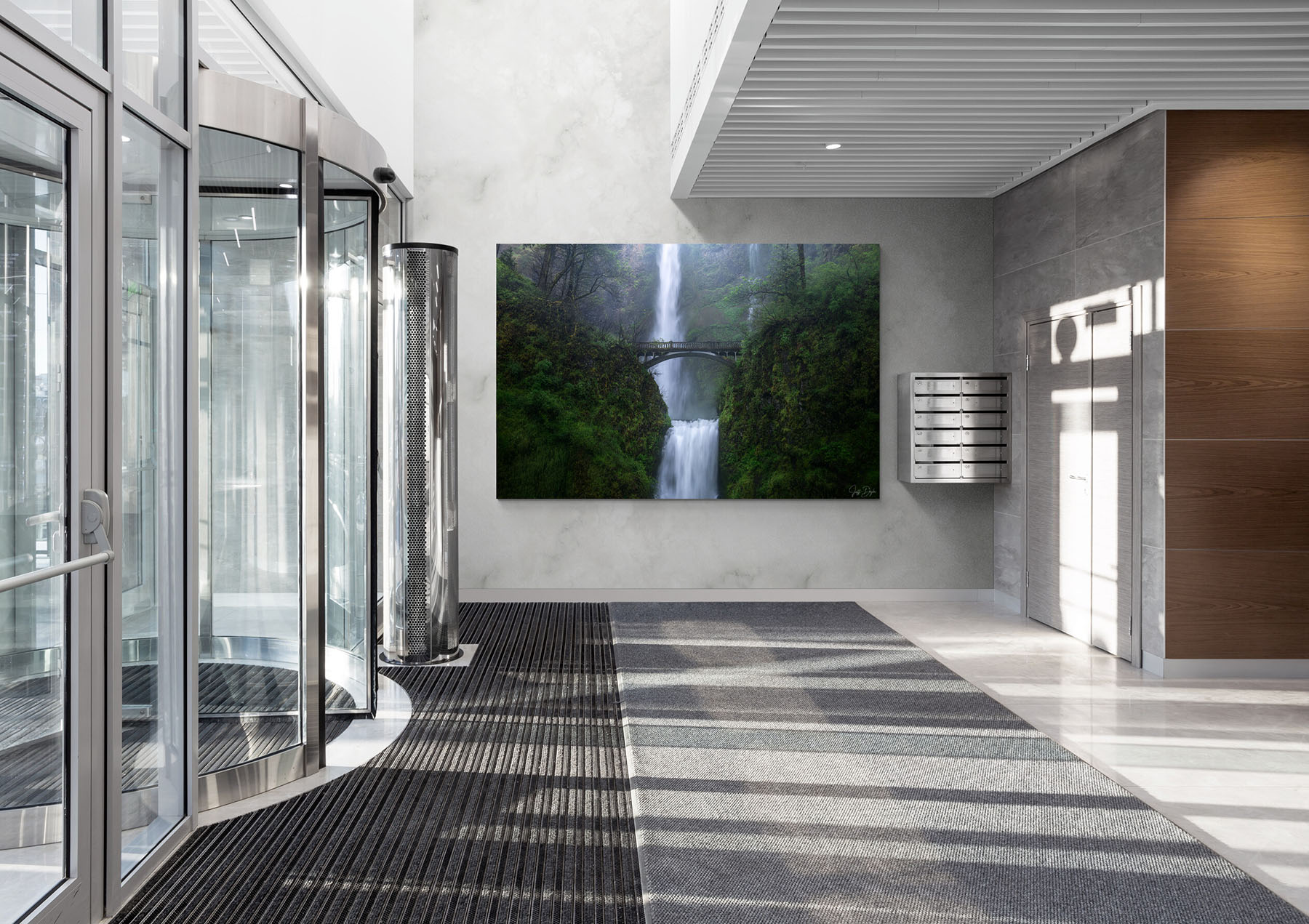
Materials and Durability in Commercial Environments
Commercial spaces live harder lives than homes. Foot traffic, cleaning crews, changing humidity, and sunlight all matter, which makes substrate choice more consequential here than in a residence. In short: metal for high-traffic and variable lighting, acrylic for controlled architectural statements, and framed paper for low-traffic executive and private spaces.
Metal Prints
Metal prints are often the right choice for offices and public-facing environments. Mine are produced specifically on ChromaLuxe. They are durable, easy to clean, resistant to moisture, and visually strong even in lower light. For many of the commercial installations I've worked on, metal has offered the best balance of durability, ease of care, and visual impact.
Acrylic Face-Mounted Prints
Acrylic presentation offers exceptional depth and a modern, architectural feel. These work well as statement pieces in controlled lighting environments. One thing to note is that placement can require more planning because reflections are often an issue if the piece is opposite windows or bright overhead sources. My acrylic work is produced as Lumachrome TruLife, which uses an anti-reflective acrylic that removes much of the glare that plagues reflective prints in commercial spaces.
Framed Paper Prints
Framed paper prints can be beautiful in executive offices and low-traffic controlled environments. I print my paper work in house on archival cotton rag, which gives private and executive spaces a quieter, more tactile presence than metal or acrylic. However, they do require more care including museum-grade glazing, stable humidity, and thoughtful placement away from direct sunlight. In most office and hospitality settings, however, I still recommend metal or acrylic because commercial environments live harder than homes and the materials need to keep up.
For a deeper comparison of print materials, sizes, editions, and how each presentation affects the finished artwork, see my guide to fine art photography editions, sizes, and materials.
Lighting and Glare: Planning for Reality
Lighting is consistently underestimated until artwork is installed. I’ve seen pieces that looked perfect in a studio become difficult to view once placed opposite large windows or under bright LED panels.
Most glare problems are solved by a combination of placement and material choice. Reflective surfaces rarely belong directly opposite windows, especially in spaces used throughout the day. It also helps to think about how light changes hour by hour. Morning sun, afternoon glare, and overhead lighting at night can turn what looks like a good wall into a problem wall. When the lighting is fixed and can’t be adjusted, choosing materials that perform well under those conditions is the best solution.
Building a Cohesive Art Program
The strongest commercial installations feel curated rather than accumulated, but curation doesn't mean that everything needs to match exactly.
One approach that works consistently: anchor pieces in reception areas and primary rooms carry the most visual responsibility and deserve the most attention in terms of scale and material. Supporting pieces in secondary spaces maintain the overall tone. Series or triptychs in hallways and corridors create continuity through transition spaces. This structure creates variety without visual chaos, and it gives the collection a logic that visitors feel even if they don’t consciously identify it.
A consistent presentation style including: uniform framing, consistent mounting hardware, and aligned hanging heights reinforces the sense that the collection was planned rather than assembled over time. The hanging guide covers the hardware and height standards that keep a multi-piece program consistent.
Budgeting and Long-Term Planning
A useful way to think about commercial art budgets is to treat the collection as a program rather than a one-time purchase. Anchor pieces carry the most visual responsibility and are where scale and material choices matter most because they justify the largest part of the budget. Supporting pieces fill out the environment and maintain cohesion at a lower per-piece cost. Installation is its own line item, particularly for large-format work in public-facing settings where safety and secure mounting are non-negotiable.
I’ve revisited spaces years later where thoughtfully selected photography still felt relevant while trend-driven décor had already been replaced. Longevity is one of the quiet advantages of fine art photography in commercial environments. Selecting for permanence rather than novelty pays off over time.
Installation, Safety, and Accessibility
Professional installation matters more in commercial settings than in homes. Artwork should be secure, appropriately spaced, and visible from both standing and seated viewpoints.
A center height of roughly 57 to 60 inches is a useful starting point, then adjust for furniture height, sightlines, and whether the space is primarily experienced standing, seated, or in motion. Proper hardware for wall type and weight is essential, and this is particularly true for large-format work. In narrow corridors, avoid protrusions. In public spaces, secure mounting is a must. When installation is done well, the art feels like it belongs. When it’s rushed or improvised, even strong pieces can feel precarious.
Maintenance and Care
Well-maintained artwork functions as a long-term asset rather than a recurring facilities problem. Manage direct sunlight where possible, since prolonged light and UV exposure can contribute to fading and deterioration over time.
Keeping a simple inventory such as what’s installed where, what the medium is, and how it should be cleaned, will make ongoing care straightforward, especially when facilities staff or cleaning crews change. A brief care note provided at installation is worth more than any amount of retroactive advice after something goes wrong.
For detailed cleaning, handling, display, and storage recommendations for metal, acrylic, and paper prints, see my guide to caring for fine art photography prints.
Making Art Part of the Experience
Art doesn’t need to explain itself, but small touches can deepen engagement. A minimal plaque with a title and location gives visitors a foothold without turning the work into signage. Some organizations develop a short internal collection story that explains why the work was selected and what it’s meant to do for the space. Others rotate featured pieces in shared areas periodically to keep the environment feeling current while maintaining a consistent overall program.
When artwork feels considered, people notice, even when they can’t articulate why. That quality is harder to manufacture than it looks, and it doesn’t come from budget alone. It comes from treating the selection process seriously from the beginning.
Planning Fine Art Photography for an Office or Commercial Space
Fine art photography enhances commercial and office environments with professionalism, emotional resonance, and quiet authority. The goal is to select work that functions well in real conditions over real time, not just in the presentation render or the first week after installation. If you're planning a commercial installation, I work directly with interior designers, businesses, and procurement teams to help select images, determine print sizes and materials, and plan cohesive multi-piece programs. Contact me to discuss the space, wall dimensions, lighting, and project requirements.
Frequently Asked Questions
What size artwork works best in offices?
Larger pieces typically perform better in commercial spaces. Scale should reflect wall size, furniture placement, and typical viewing distance. A reception wall usually needs a single 48x72 or larger anchor; conference rooms suit 30x40 to 40x60. When in doubt, go bigger, since undersized work is the more common mistake.
How do you choose art for an office?
Start with the function of the space, then consider wall dimensions, viewing distance, brand tone, lighting, and durability. Reception areas usually benefit from fewer, larger statement pieces; conference rooms from calmer compositions; corridors from consistent series; and executive offices from work with more nuance at closer viewing distances.
What’s the best print medium for high-traffic areas?
Metal and acrylic prints are generally preferred for commercial environments due to durability, ease of maintenance, and long-term visual stability. Framed paper prints can work well in controlled, low-traffic spaces like executive offices.
How do I avoid glare?
Plan placement before installation, avoid mounting reflective surfaces opposite windows, and account for how lighting changes throughout the day. Material choice is often the most practical lever when placement is constrained.
Should we commission artwork or buy existing pieces?
Commissioning is worth considering for exact sizing needs or cohesive multi-piece installations where consistency is critical. Existing work is typically faster and more cost-effective, and the selection available from established photographers is usually broad enough to meet most commercial briefs.